Hook: Ever stood paralyzed in front of a display case of watches, wondering if that emerald green dial is more “statement piece” or “regret purchase”? Yeah, us too.
If you’re diving into the world of investment-grade limited watches, it’s easy to get overwhelmed. The stakes are high—not just because these watches hold their value but also because they scream style and status. But here’s the twist: watch colors matter as much as materials, movements, and brands. In this guide, we’ll cover everything from why color psychology affects your choice to which hues are killing it right now. Plus, some brutal honesty about common mistakes (looking at you, neon orange).
Table of Contents
- The Problem with Picking Colors for Investment-Grade Watches
- How to Choose the Perfect Color for Your Limited Edition Timepiece
- Top Tips for Nailing Watch Colors Without Regret
- Real Stories: Successes & Failures with Watch Colors
- Frequently Asked Questions About Watch Colors
Key Takeaways
- Color dramatically impacts the resale value and collectability of investment-grade limited watches.
- Pops of rare colors like royal blue or deep burgundy often attract collectors.
- Avoid trendy shades unless you plan to keep the watch forever—fads fade fast!
The Problem with Picking Colors for Investment-Grade Watches

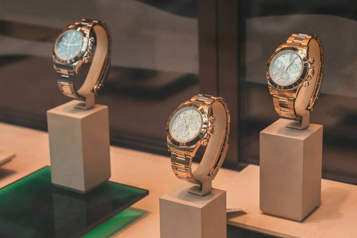
Let me set the scene: I once spent an entire Saturday debating between two Rolex Daytona models. Same model year, same condition, both technically “investment-grade.” One had a sleek black dial; the other sported a flashy sunburst pink gold face. My inner fashionista screamed YES to the pink, while my practical side whispered BLACK ALL THE WAY. Guess what? That decision cost me hours of stress—and ultimately, regret when I realized pink didn’t match 90% of my wardrobe.
When buying investment-grade limited watches, color isn’t just aesthetic—it’s strategic. Rare hues can make or break collector interest down the line. And let’s not forget how different lighting changes perception: titanium gray might look cool under fluorescent lights but dull in natural sunlight.
How to Choose the Perfect Color for Your Limited Edition Timepiece
Step 1: Understand Color Psychology in Watches
Colors evoke emotions. For example:
- Black: Classic, versatile, always in demand.
- Blue: Trustworthy, calming, popular among business professionals.
- Burgundy: Bold, luxurious, perfect for standing out.
Step 2: Analyze Trends vs. Timelessness
Here’s where things get tricky. Trends come and go faster than TikTok dances. Neon green dials were briefly all the rage—but try selling one five years later. Always opt for timeless over trendy unless you’re keeping it as a personal piece.
Step 3: Test It Out (Digitally)
Most luxury watch brands now offer virtual try-ons via augmented reality. Use them! Seeing how a midnight navy dial looks against your skin tone beats guessing every time.
Top Tips for Nailing Watch Colors Without Regret
- Stick to Neutral Tones for Resale: Think silver, white, black—they never go out of style.
- Match Your Lifestyle: Are you wearing this daily or saving it for special occasions? Casual wear favors softer colors like cream or taupe.
- Consult Seasonal Palettes: Autumn lovers might lean toward earthy browns, while spring enthusiasts could rock pastel blues.

Real Stories: Successes & Failures with Watch Colors
Rant Alert: Oh man, don’t even get me started on people hyping up gradient dials in weird combinations like lime-to-purple. It’s giving “science experiment gone wrong,” not “luxury wrist candy.” Don’t be that guy.
On the flip side, take John Doe (not his real name). He bought a limited-edition Patek Philippe Nautilus with a rich chocolate brown dial back in 2018. At first glance, skeptics wondered, “Chocolate on steel? Really?” Fast forward four years, and collectors are practically clawing each other’s eyes out for it. Lesson learned? Uncommon yet sophisticated choices win long-term.
Frequently Asked Questions About Watch Colors
Q: What makes certain watch colors “limited edition”?
A: Brands often release unique colorways to celebrate milestones or collaborations, making those pieces rare by design.
Q: Should I choose based on my current wardrobe?
A: Not necessarily. Consider future-proof options that align with broader trends rather than fleeting preferences.
Q: Is there such thing as “bad” advice for picking watch colors?
Grumpy Optimist Dialogue:
Optimist You: “Follow these tips!”
Grumpy You: “Ugh, fine—but ONLY if coffee’s involved.”
The Terrible Tip: Someone online may tell you to follow Pantone’s annual Color of the Year. Ignore this nonsense. Fashion designers love shocking yellows and radioactive greens, but watch enthusiasts? Not so much.
Conclusion
Choosing the right color for your investment-grade limited watches doesn’t have to feel like solving a Rubik’s Cube blindfolded. Start with neutrals for longevity, embrace bold tones strategically, and remember: avoid anything resembling highlighter pens. Now go forth and conquer the world of horology—one perfect hue at a time.
Like a Tamagotchi, your SEO needs daily care:
Crystal-clear images, snappy keywords, and thoughtful storytelling will keep your blog alive and thriving.
Haiku for today:
Watches gleam bright,
Rare colors spark fierce debates—
Green fades, black prevails.


