“Ever stared at your wrist, wondering why your watch feels… blah? Spoiler alert: It’s probably the colors.”
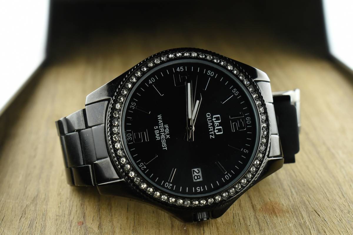
Fashion-forward tech enthusiasts know that watches aren’t just tools for telling time—they’re statements. And when it comes to style, one of the boldest moves you can make is embracing high-contrast watch color schemes. Think black-on-white, cobalt-on-gold, or even neon-on-charcoal combinations that scream confidence and sophistication.
In this guide, we’ll unravel how high-contrast watch color schemes can elevate your accessory game, from understanding the science behind contrast to tips on styling them like a pro. Buckle up—you’re about to learn:
- Why contrast matters in watch design
- A step-by-step guide to choosing the perfect high-contrast scheme
- The dos (and *don’ts*) of pulling off bold watch colors
Table of Contents
- Why Contrast Matters in Watch Design
- Step-by-Step Guide to Picking High-Contrast Schemes
- Tips for Styling Your Bold Watch
- Real-Life Examples of Killer Combinations
- Frequently Asked Questions About Watch Colors
Key Takeaways
- High-contrast watch color schemes enhance visibility and aesthetic appeal.
- Bold hues can complement any outfit if paired thoughtfully.
- Understanding color theory helps avoid fashion faux pas.
Why Contrast Matters in Watch Design
Let’s get real: Watches started as functional devices before evolving into status symbols. But their evolution didn’t stop there—today, they’re works of art sitting elegantly on your wrist. The difference between “meh” and “wow”? Often, it’s all about contrast.
Imagine wearing a navy dial with dark gray hands—it’s like trying to read fine print under candlelight. That’s where high-contrast watch color schemes come in. By pairing opposing tones, designers create visual interest while ensuring readability. It’s not rocket science; it’s color psychology 101.

The Science Behind High-Contrast Appeal
Colors opposite each other on the color wheel naturally stand out against one another. For example:
- Warm vs. Cool Tones: Pair fiery orange indices with cool teal accents.
- Monochrome Magic: Mix deep blacks and bright whites for timeless elegance.
“Confession time—I once bought a neon pink watch strap thinking it’d pair well with my olive green watch face. Spoiler: It looked like a toddler’s toy explosion. Lesson learned!”
Step-by-Step Guide to Picking High-Contrast Schemes
Ready to find your dream watch combo? Here’s a no-nonsense roadmap:
Step 1: Start With Your Skin Tone
Your skin tone influences which colors pop against your wrist. Fair skin often pairs beautifully with crisp blues and silvers, while warmer complexions shine with golds and earthy browns.
Step 2: Choose Dials with Bold Markings
A busy dial might overwhelm subtle contrasts. Opt for clean lines and bold markers that let the color scheme take center stage.
Step 3: Play with Strap Options
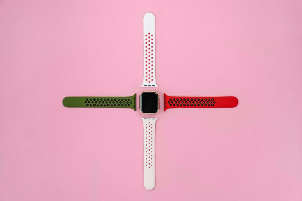
Metal bracelets exude class but limit experimentation. Leather or silicone straps allow you to swap styles effortlessly. Chef’s kiss for versatility!
Grumpy Optimist Dialogue:
Optimist You: “Switching straps is so easy!”
Grumpy You: “Unless you lose the tiny screws during assembly…”
Tips for Styling Your Bold Watch
Now that you’ve picked your statement piece, let’s talk integration. Because owning a killer watch means nothing if it clashes with your vibe.
- Tie It Into Your Outfit: Match hints of your watch color to shoes, belts, or jewelry.
- Go Neutral Elsewhere: Let the watch be the star by keeping surrounding elements simple.
- Balance Warmth & Coolness: If your watch leans warm (gold, bronze), balance it with cool-toned fabrics (navy, slate).
Rant Alert: Why Minimalism Isn’t Always Better
Sure, everyone loves minimalism—but too much sameness gets boring. I mean, how many matte-black watches does the world need? Don’t be afraid to turn heads. Life’s short; wear something worth noticing.
Real-Life Examples of Killer Combinations
Need inspiration? Check these jaw-dropping combos:
- Cobalt Blue + Gold Accents: Perfect for corporate settings yet flashy enough for weekends.
- Neon Green + Black Dials: Edgy, sporty, and guaranteed conversation starters.
- Pearl White + Deep Burgundy Straps: Timelessly chic for formal events.
Case Study: The Iconic Rolex Daytona
This legendary model proves how impactful high-contrast watch color schemes can be. Its signature black-and-white panda dial remains iconic decades later—proof that bold always wins.
Frequently Asked Questions About Watch Colors
Q1: Are high-contrast watches suitable for everyday wear?
Absolutely! Just ensure the colors align with your wardrobe staples. Stick to neutral backgrounds if unsure.
Q2: Can I mix metals and fabrics without looking tacky?
Yes, blending textures adds depth—as long as the overall palette stays cohesive. Pro tip: Avoid more than three primary colors.
Q3: What’s the worst mistake people make when buying colored watches?
Buying based solely on trends. While Pantone may declare a “Color of the Year,” ask yourself: Will I still love this in five years?
Conclusion
High-contrast watch color schemes transform wrists into canvases, turning functional accessories into bold expressions of personal style. From learning the basics of contrast to mastering tricky pairings, this guide aims to empower your choices.
So go ahead—ditch the vanilla designs and embrace vibrant aesthetics. After all, life’s too short for boring watches.


